My name is Marta Tsisaruk, I am the Product Designer at Enestech Software, which is part of the TECHIIA holding. Six months ago, we carried out a complete redesign of one of our main products - Senet. We found all the old bugs and also figured out how to bring business that wants to make money and users that don’t pay that much attention to the interface together
Further, I will tell you why the redesign was needed, the way we did it, and what conclusions we made.
About the product and how we came up with the redesign idea
In 2017, our company launched Senet, a SaaS solution for computer club and cyber arena management. It has an admin panel for owners and administrators and a gamer interface.
Using the gamer interface, a guest pays for a session, chooses games to play, checks the session time, and sees the information about all the club's promotions.
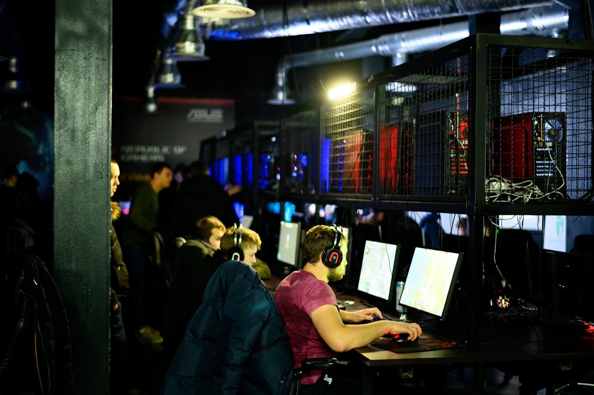
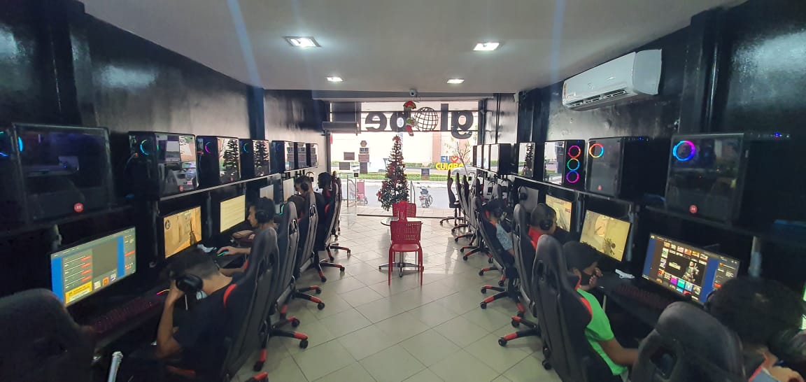
Credits: eSport Club SKiLL
When launching our product, we were more focused on the B2B part, so we paid very little attention to the gamer interface. We created it based on our user experience and some recommendation from club managers.
Nevertheless, Senet became a successful product and was for the best SaaS solutions. The admin panel allows you to control the club load and finances from any place in the world. And the gamer panel had a few but still customizable options.
At the start of sales in 2017, we had only two clients - the IT Land network in Kyiv and the SKiLL club in Odesa. Today we cooperate with almost 2000 computer clubs in 60+ countries worldwide.
Credits: Senet.Cloud blog
When we got so many clients, we decided to improve the gamer interface. The pandemic also made its impact on the redesign process. We created a new monetization model of the product, but the previous gamer interface was hindering its implementation.
Here are some details about my role. Before Enestech Software I had experience in development but as a Project Manager. I joined the company as a designer, I worked on Senet from its beginning, and after 10 months I became the only Product Designer. I was creating the interface according to the wishes of the main client. Then I was creating a design system, communicating with customers, processing feedback, testing solutions, and scaling the product, all the tasks that a good Product Designer should solve.
Now more details about our redesign. We now have 12 steps that can be applied to different products.
1. Determine the trouble spots of the old interface
We have highlighted several major change points in the old interface.
- Complex support and scaling
We created the shell without a design system and standards because we needed it fast back then. Each developer was writing the code differently, and over time it became impossible to make interface upgrades. It took longer to standardize old interface elements than to create an interface from scratch.
- Inconsistency with monitor evolution trends
Creating the old interface, we focused on Ukraine and neighboring countries and did not take into account that in the global market, clubs are increasingly using monitors with more than 2560 pixel resolution. This is one of the things that clubs use to attract gamers, not everyone has such a pricy monitor at home. The new interface had to meet these requirements.
- Lack of settings
Depending on the needs, clubs could only change the gamer interface background, logo, and theme. But they could not, for example, display the information they needed for the gamer on the first screen. In the new version, we wanted to add the option to customize the main page.
- Complex and unnecessary elements
Reviews and analytics have shown that not all parts of the shell are understandable to gamers. And some features were not used at all.
2. Meet the business requirements
Senet is initially a subscription-based service. Clubs pay a fixed cost per month for chosen features.
When scaling, we found that this model would not work in some countries. Club owners basically did not pay for the licensed software and preferred, albeit lagging and not very functional, but freeware. However, these are markets with a lot of gaming clubs and gamer audiences. It was possible to attract them by offering Senet for free, but with display ads.
On the other hand, gaming clubs that were already using the paid version wanted to post video ads, banners, and news about club promotions. This is an important part of the club monetization system.
That’s where the main problem was, ads simply did not fit into our old gamer interface. Therefore, one of the objectives of the redesign was to add ad slots.
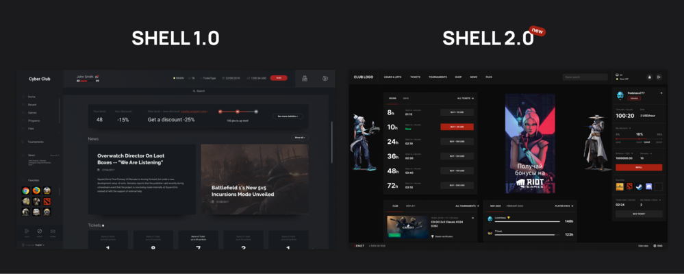
Shell 1.0 and 2.0 main page
3. Apply the user behavior analytics
Senet is a B2B product. However, it is used not only by club owners and administrators but also by gamers. This means that it also can be a B2B2C product. In the first interface, we paid a little attention to the gamer’s convenience, which means that we had to fix this mistake during the redesign.
Our goal was to improve the user experience, integrate ads and content from the business so as not to annoy the players. Otherwise, having a lot of distracting information, the user simply will not find the game he/she came to play.
To solve this problem, I needed to understand how gamers behave while visiting clubs. I have used several analytics tools. The most useful was the Smartlook integrated into the old interface, which records how users interact with the interface.
After reviewing several hundred videos, I made two important conclusions:
- If a gamer spends five hours in the club, he interacts with the interface for 8 minutes only. This is just a short getaway to launch a game from the list, nothing more. There are also local features. For example, in some CIS and European countries, the user must register by submitting a phone number. Thus, the time inside the interface is increased by three minutes.
- The club management is interested in keeping the gamers in the interface for a longer time, so that they go to different pages, see information about the club's offers, club news, and promotional packages.
We had to at least not increase the time spent by the gamer in the interface. Moreover, you don’t need to put tons of information in the interface. If you make it too complex and overloaded, the user will probably not see the needed information.
4. Conduct functional analysis
Next, I needed to understand what functions are important for clubs and which ones they don't use. For example, some computer clubs sell time packs and offer packages to the player at the start of the session. This was a key feature for 65% of the clubs.
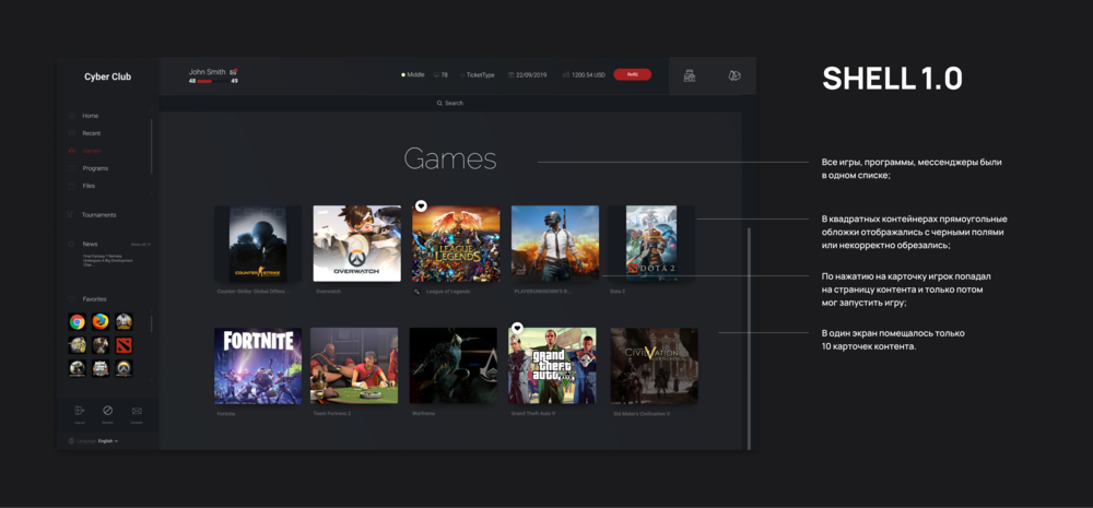
Old Shell games catalog page
As for other options, it turned out that they are not used at all. For example, in the old interface’s catalog, each game had an individual page, that contained description, screenshot, video, and additional information in different languages. Clubs had to fill in such pages themselves, we were providing only game titles and covers
When I studied the clubs’ catalogs, I found out that no more than 20% of filled pages. But even these 20% were ignored by gamers. Gamers come to play a game they already know, they know what it’s about. We removed this option in the new interface, and nobody misses it.
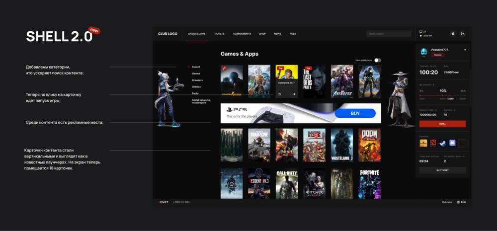
New Shell games catalog page
5. Perform interface analysis
Next, I analyzed how users interact with the interface and what problems arise in this case.
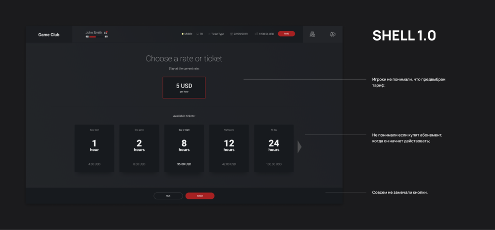
Start page of the old Shell subscription sale
Previously I mentioned that in 65% of clubs when the computer starts, the user sees game time package offers, so such clubs get money in advance.
Viewing screencasts from Smartlook showed gamers were a bit confused with this page. They were clicking the wrong buttons, did not understand how to close the window and go to the games, often bought packages by mistake.
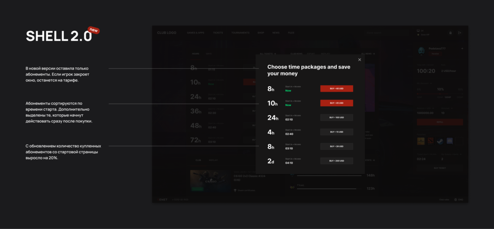
Start page of the new Shell subscriptions sale
It was quite disappointing because I was the one who created this feature for the old interface. But I had very little experience back then, moreover, we were in a hurry to finish the product and did not have time to test this feature on real users. And we had no feedback from clubs about gamers facing these issues.
6. Conduct user interviews
In parallel with viewing screencasts, I launched a questionnaire for clubs in order to get contacts of gamers who are ready to share their impressions of interacting with the interface.
Interviews with gamers confirmed the assumptions: they come to the club with one purpose - to play. Gamers do not remember the program interface on a PC. They are more concentrated on other factors, such as the time cost, the level of technology, and the chair comfort.
I also discussed their wishes with club owners. I was interested in what brings their clubs more income. Based on the interview, I concluded what features are of the highest priority.
At the same time, it was important for us to integrate advertising into the interface as our product monetization channel while clubs want to sell their time packages and their promotions. A balance had to be found between these tasks.
Then I interviewed admins, discussed the gamers’ most frequent problems while interacting with the interface. It turned out that the contact admin feature that the old interface had, which allows you to send the admin a text message, was never used, perhaps they didn’t even find it. Players preferred the good-old “Hey, can you please come over?”.
7. Study competitors' products and product design trends
After the interview, I moved on to analyzing Senet’s competitors. The main ones are ggLeap from the USA and Gizmo from Greece. There are a few more old non-cloud solutions out there. They are not updated or supported, but some clubs prefer to save money and still install them.
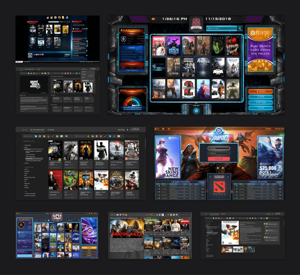
Examples of competitors' interfaces
Some clubs create their own programs, just like we did at the beginning. But their number is getting smaller, because it is expensive to develop your own product, and the competition in this segment is too high. It is now cheaper to switch to a high-quality modern SaaS with constant updates and 24/7 customer support.
While studying competitors' products, I noticed that they often change the gamer interface, but these upgrades mainly concern color solutions. Apparently, this is how they try to evoke new emotions in the gamers.
The main design conclusion was that the interfaces of similar services are made according to the 1990s trends - in the skeuomorph style using volumetric images, as in the Dendy Tanks interface.
The problem is that such an interface is difficult to develop and maintain. Simplicity, that’s what’s crucial for modern interfaces. And that was our goal, we were focused on making it easier for the player to navigate in the shell, find the information and features they need. Moreover, the majority still do not remember how it looks.
There was a lot of controversy on this topic in our team. Some believed that it was necessary to follow the competitors. Others wanted to use Senet's corporate identity and vibrant colors to make the product associated with our company.
As a result, our design turned out to be simple and flexible, and far from being like competitors’. As a reference, I also relied on the game launchers’ design trends. For example, on , , and tournament platforms like , whose interfaces are extremely simple, there is nothing redundant there.
We also took care of the little things. To fill in the game card, admins, as a rule, found images on the Internet which usually were vertical. In our old interface, the shape for the image was square, which caused part of the image to be cropped, and it was quite annoying. In the new interface, I introduced the vertical format of "covers" and filled the catalog with ready-made beautiful covers so that the admins would not waste their time.
8. Limit the customization options
While working on the prototype of the new interface, I was keeping in mind the known contradiction: the more customization tools a user gets, the less he/she uses them.
Here’s an example. In Slack, you can customize literally everything: the button color, the font color. You can change the code directly in ColorPic. But who uses these settings? Maybe just a design theme from a ready-made setup?
The new Senet interface has the ability to change backgrounds and switch themes in a couple of clicks. The old interface had four color themes: red, blue, green, and yellow. Statistics have shown that this is quite enough. We had no more than a dozen requests to add a theme from the clubs that have their own brand books with corporate colors. So we updated the themes, but we haven't increased their number in the new interface yet.
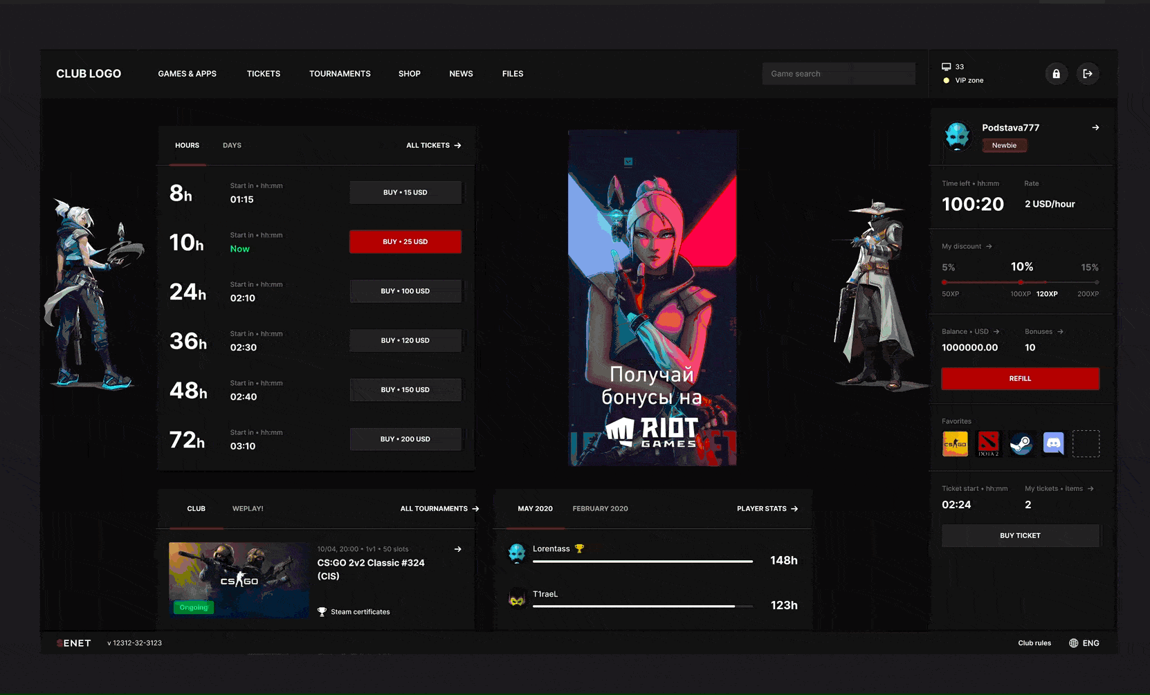
An example of a new Shell with different themes, backgrounds, and logos
9. Conduct user testing
I transferred all the necessary features, such as season ticket purchase, game search, and game launch, log in, from the old interface to the new version. But some of the features had to be completely redesigned.
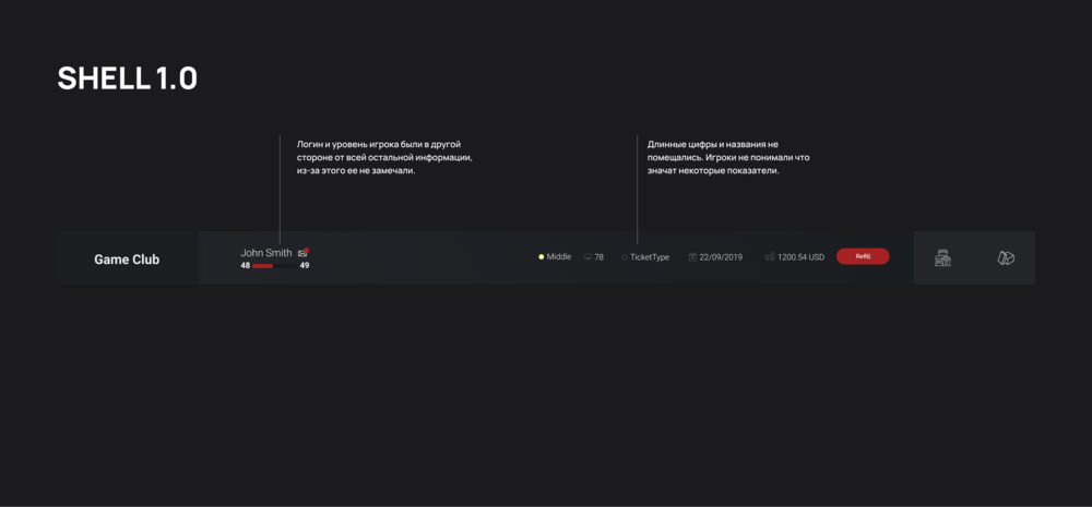
Player panel in the old Shell
For example, in the old version, at the top, there was a session information panel showing how much game time is left, how the time is charged, and the player's balance. The panel was too narrow and therefore difficult to read. Some indicators, like the balance in Kazakhstani tenge, simply did not fit. Therefore, first of all, I made the panel larger and placed all the necessary information in the form of a list - one below the other.
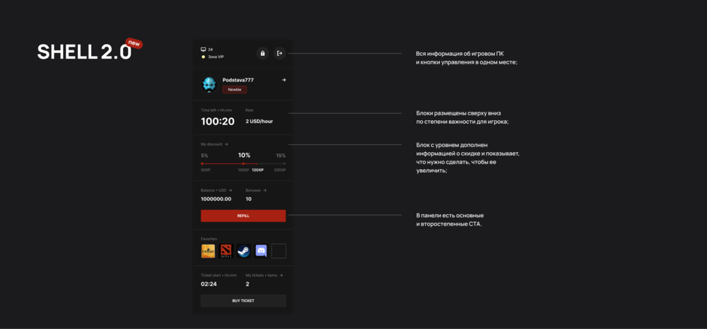
Player panel in the new Shell
This time we tested the prototype on real gamers. I knew that it would be difficult for experienced gamers who used the old interface to switch to the new design, and brought in third-party gamers to the tests.
The prototype was redesigned five times until I was convinced that gamers easily find what they need and intuitively understand how everything works. After the tests, I came to the conclusion that in the latest version, the players quickly found the necessary information and performed actions with almost no mistakes. However, old-interface users may experience difficulties due to long experience of interaction with the previous version.
10. Get ready for the haters
After finishing the prototype tests, we moved on to the next stage - developing mockups, writing documentation for developers, and creating a new player shell.
Once done with it, the clubs were predictably divided into those who really wanted to test the new interface and those who did not want to switch to it in any way.
Many admins really liked the interface once they saw it, but almost all the gamers, on the other hand, as I expected, hated it. It’s understandable from their perspective, there were too many changes made, and if you are not used to working with such a solution, it can be difficult.
Credits - Ves’ Kryvyi Rih
Most of all, gamers were pissed off by the exit button. In the old version, it was at the bottom left, and I moved it up to the right, where the Windows page close button is. It was due to the old habit: gamers who had never used the old version were finding this button easily.
However, experience has shown that if a gamer comes to the club once every two weeks, it will take him no more than a month to interact with the new interface without any problems.
11. Take constructive criticism into account
Some clubs tested the new interface on one computer only and then decided not to go for it. So we decided to attract such clients not with a new design, but with new tools.
I created a special document for the support service, where the support service was adding feedback from the clubs. In the beginning, it was just pure hate, but over time, constructive comments appeared, which we took into account, and implemented.
When users tried out the new version, we got tons of comments asking for new features. We paid attention to the number of similar requests. If it seemed to us that these proposals were relevant, so we decided to implement them.
We released the new interface in July 2020 and now, eight months later, we are rolling out the last 20% of clubs to the new interface. On the one hand, we no longer support the old version, on the other hand, the availability of new features is a decisive factor for such users when choosing an interface version. After trying new options, even the haters agreed that the new interface is better.
12. Evaluate your goals
With the help of the new interface, we solved critical problems, fulfilled the business’ and users’ yearnings, and provided the scaling option. Now you can embed ads into the interface and change the navigation system for more effective communication with gamers.
The new main menu is a place for advertisements and club information, that’s the first thing that a gamer sees once the computer is on. The game catalog is made in the form of a specific button. This is one additional click, but now you have an additional place to interact with gamers, on the main page, and in the game catalog. More places for your ads.
Let’s sum up
When thinking about a redesign, remember that it is a problem-solving tool, not an expression of someone's aesthetic preference. And its reasons should be justified. These can be technical problems that interfere with scaling your product, business logic that requires new tools to be added, or difficulties in the interaction process.
The redesign is always associated with significant financial and time costs. In addition, you will definitely face haters, because users usually don’t like changes in their favorite products’ interface.
In our case, there were plenty of significant reasons for redesigning. We could not smoothly change the old interface to the new one, although that would be more correct. We were forced to take this step, among other things, in order to make it easier for gamers to interact with the interface.
However, we did face a bunch of hate from gamers. But I was sure that these changes are justified, and they make the interface more convenient and intuitive, this hate will surely shift to constructive criticism.
And this is exactly what happened. In six months since the update release, 80% of our customers switched to it. They received new, more effective tools to communicate with gamers, and Enestech Software received additional advertising revenues.
And what about you guys, do you have any successful or unsuccessful redesign cases? Drop them in the comments.
Original article on