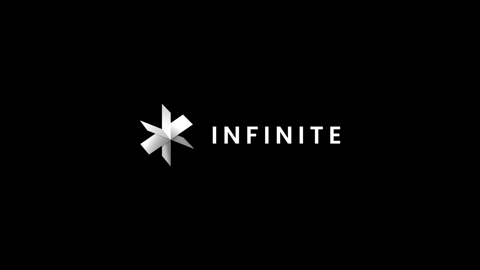
In July 2021, JMind, one of the TECHIIA holding companies, launched its own video streaming platform for the B2B segment — Infinite. It can be deployed as a stand-alone solution, consisting of a mobile application and an admin panel, or integrated into existing customer solutions. Infinite launches in the Asian market, which is the most technologically advanced and actively uses live streaming in various industries. Mikhail Ganzhenko, JMind’s Design Lead, tells how the product identity was created.

Mykhailo Ganzhenko, Design Lead, JMind
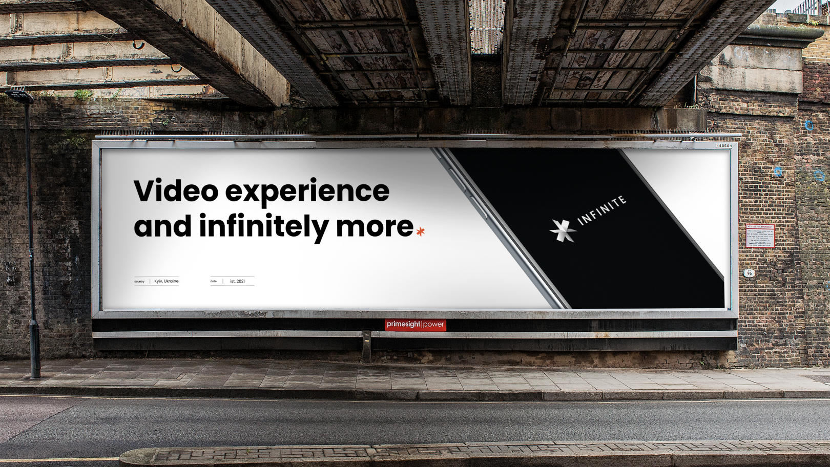
Infinite is a white-label B2B product for video content distribution. The platform is designed for live video broadcasts, video hosting, and content monetization. It also includes interactive elements such as chat for communication, local currency, animated stickers, and a bunch of other options. The customer from the business side has full control over the application via the admin panel.
Infinite is primarily focused on e-commerce, sports, esports, TV, and religion, but also can be used in other directions.
The main task
Before creating an identity, we agreed on three points.
1. Infinite is a white-label solution. It assumes that on our "box" each client can impose their own brand and color, customize the interface and tools to meet their needs.
But it was necessary to give Infinite a recognizable face for marketing and promotion. Our B2B client should recognize the product among other solutions and associate it with video streaming.
2. The service aims to spread to all continents but will start in Asia. So, for the logo, we need universal symbols and cultural codes.
3. Naming sends us to infinity, a relentless stream. At the same time, Infinite is a popular name. And this is the risk of being too corny: try to google the word — and you will get infinity signs, circles, loops, spirals. Therefore, it is necessary to go way deeper, into a more complex analysis of associations, to stand out, but to bring the idea.
We had 2-3 weeks for everything.
The Idea
The first research really led us to a dead-end of primitive visualizations. I didn't like any of them from the very beginning. Then we went the old way — we started twisting the word Infinite and building associations. Went to "eternity", "infinite stream" (stream) and movement.
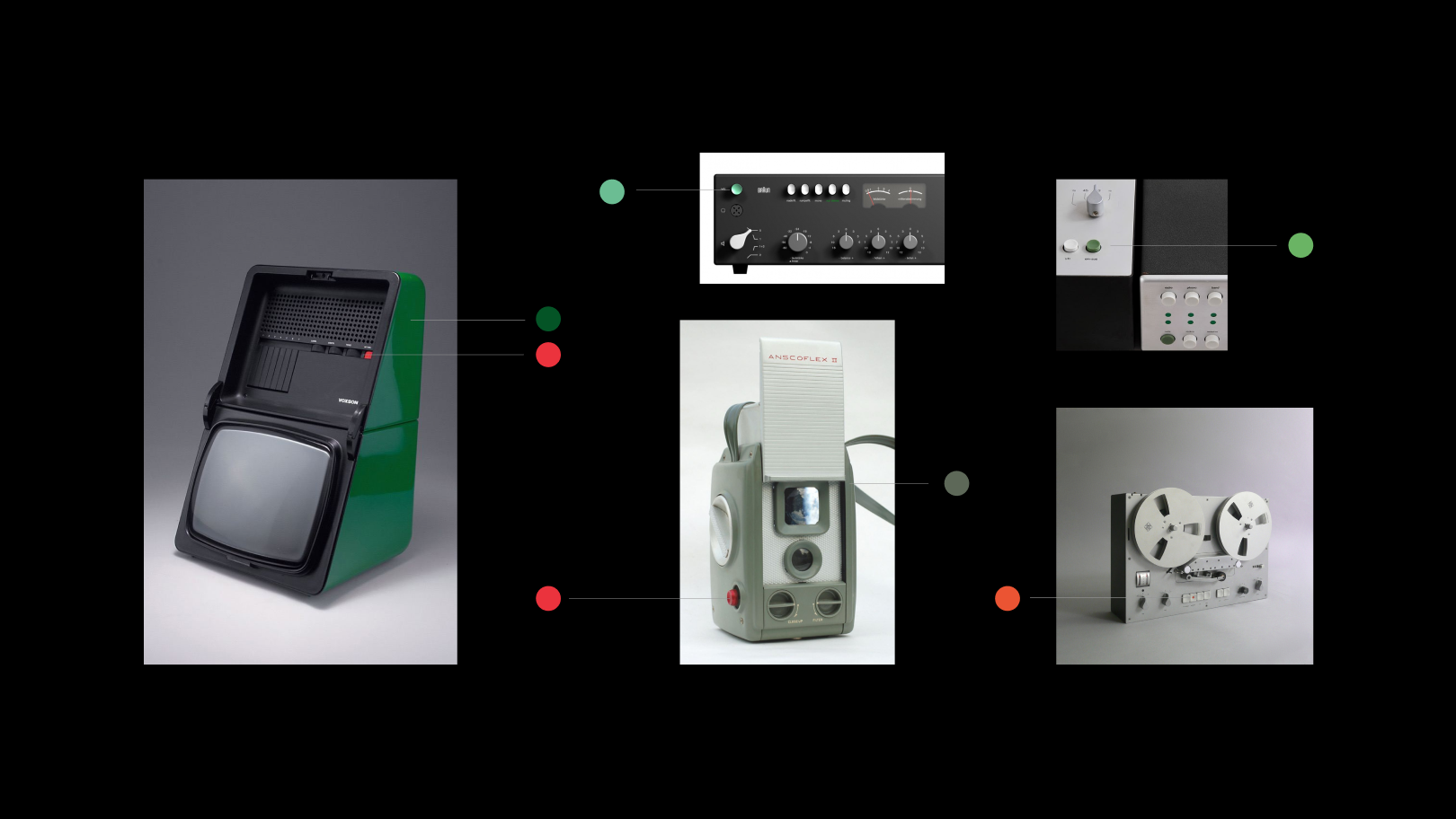
Here we heard the story of perpetual motion machines. People have long dreamed of building a mechanism that will endlessly twist itself. They tried to circumvent the laws of thermodynamics, the rules of leverage — but in the end, they only proved these laws even more.
We investigated artifacts, old drawings, da Vinci works to remember how people imagined the eternal engine. What was interesting is that for the most part, the schemes were similar, wheel-shaped.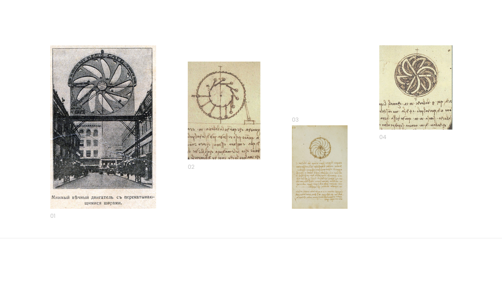
Now we only needed to integrate it into the video content. So, we began to think about forms and associations. And once again history came to the rescue. Photos — silent movies — projectors, filmstrips — TV — wide frame, camera matrix, and gadget screens. They are all united by a rectangular shape, wide for video.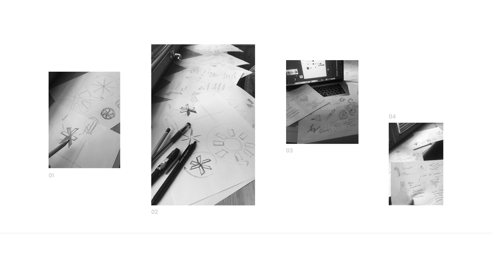
Colors
How to convey that the product is a white label solution, i.e. it can be different, of any color?
For example, involve a wide range of primary video colors. We looked at NTSC, PAL, video equipment, and cables. We took as a basis the idea that each frame in our "engine" has its own color. That is, the product is a kind of chameleon, it can be of any color.
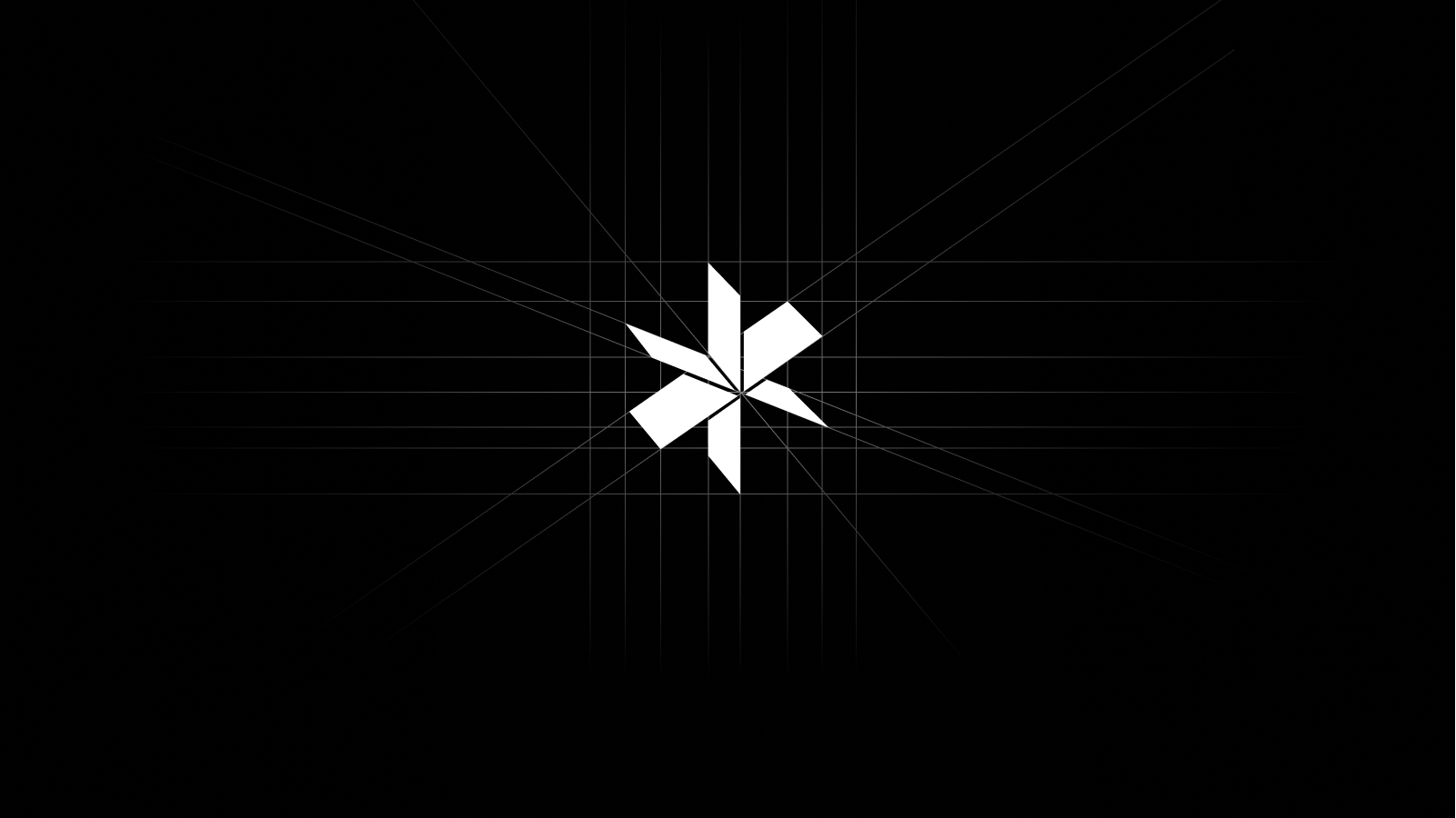
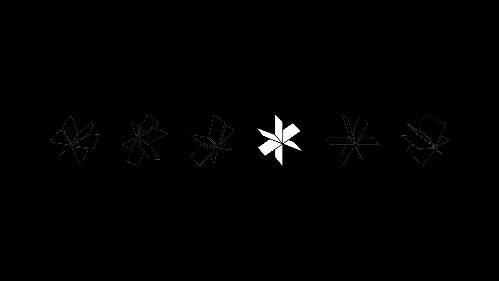
We did like that idea. When we presented the first version of the concept to stakeholders, they really liked the geometry. But we had to switch to a slide with a color version, where everyone seemed to be quite disappointed. Our logo has become like a children's windmill.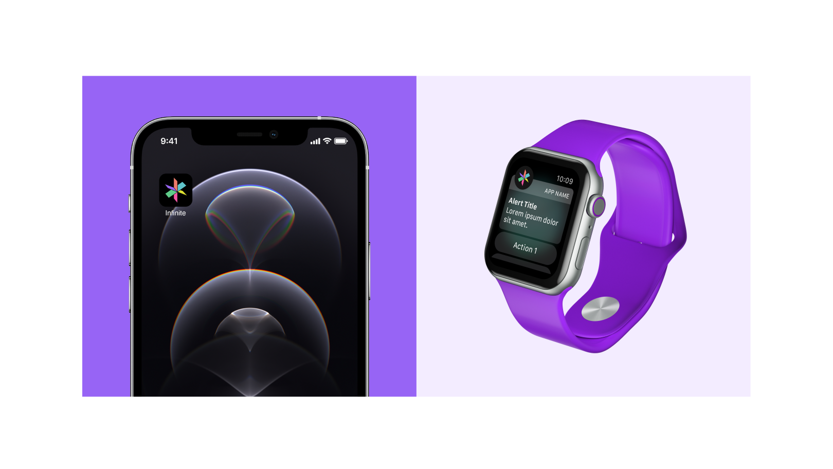
It became more stylish and thoughtful. However, the logo, especially when looking from a distance, became flat and star-like. We had to find the right angle of the video engine to avoid confusion. For more inspiration, our designer made a physical model of the logo.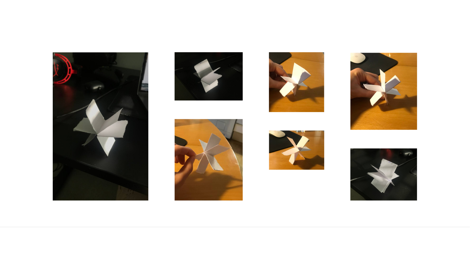
As is often the case, the best perspective option was the initial one. The problem was that "frames" have limits. There was no feeling that they were whole and united. So we added shadows and volume to make it look like a moving object.
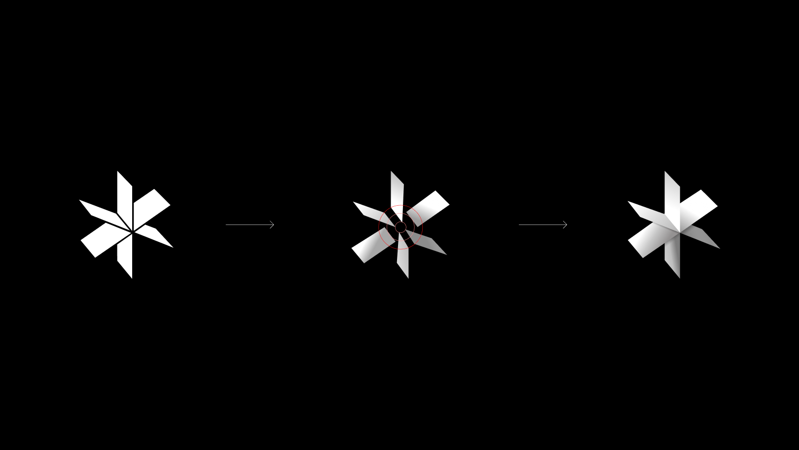
A few words about our approach. One of the design trends is to go for the flattest simplified logos. After all, the fewer details, the easier it is to apply the logo. For us, a three-dimensional logo can be a possible limitation. But it's definitely not about imitating or breaking trends. Shadow, 3D effect or lighting look appropriate if they organically complement the concept. It was crucial for us to convey the idea and make an identity that will appeal to everyone. Maybe in time, we will also go to the abstraction from which we started.
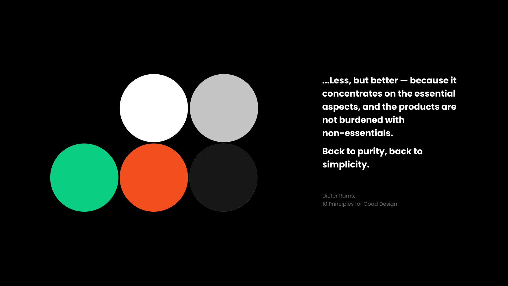
To maintain versatility, we used black, white, and gray in the main palette. Two accent colors had to be added to them.
Video equipment and live broadcasts came to the rescue. For example, the Rec button or the "On Air" inscription is always bright orange/red. The "On" or "Play" buttons are usually green. This is a kind of cultural and technical code which is also contrasting.
Typography
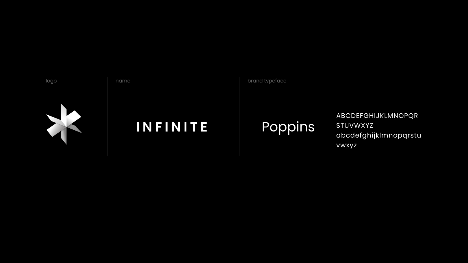
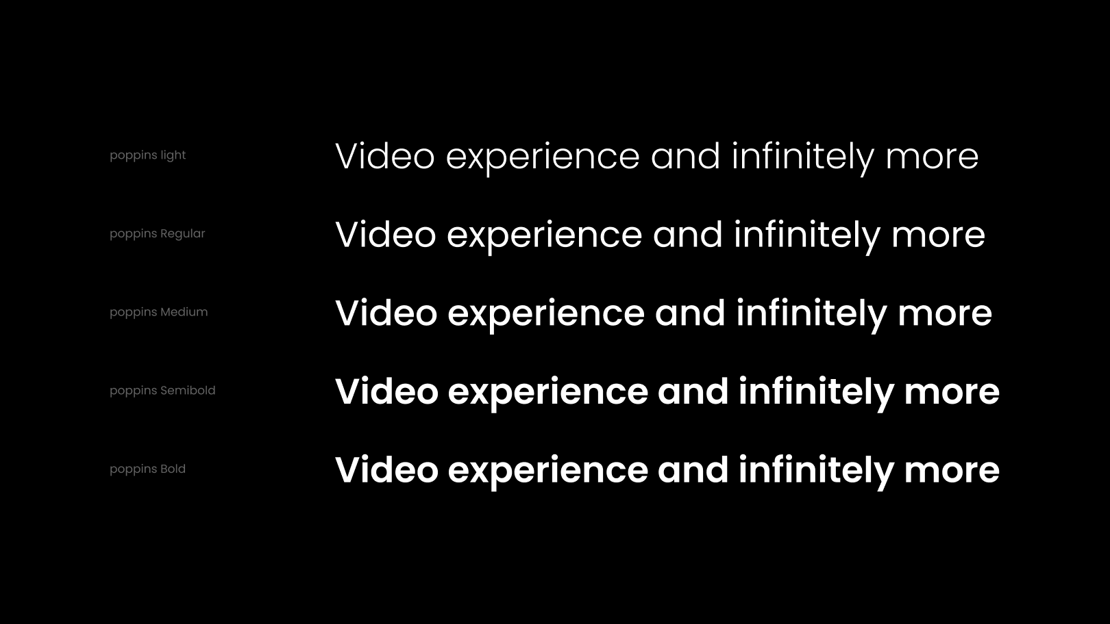
For the font, we chose Poppins by Google. It was the only option that fit into our presentation of the font logo. Together with black and white colors, it emphasizes thoughtfulness and a certain "luxury". Our designer was inspired by space themes.
Ideas for identity came straight from the concept. Each frame is a separate video/live stream. For example, when we show certain content using our identity, we have to do it within the frame.
With Infinite, we've come a long way — making a product that doesn't have a "face" for the average user but creates a memorable image for a potential business customer. Infinite identity helps build the brand, marketing, and communication, to highlight product values. Now we are on the verge of the first tests and reviews, and after that — the evolution of Infinite and its design.
Original article on