A vibrant style accompanies the new stage of development for the holding. At its core is the desire to reflect essential aspects of shows since vibrant shows are one of WePlay's key specializations.
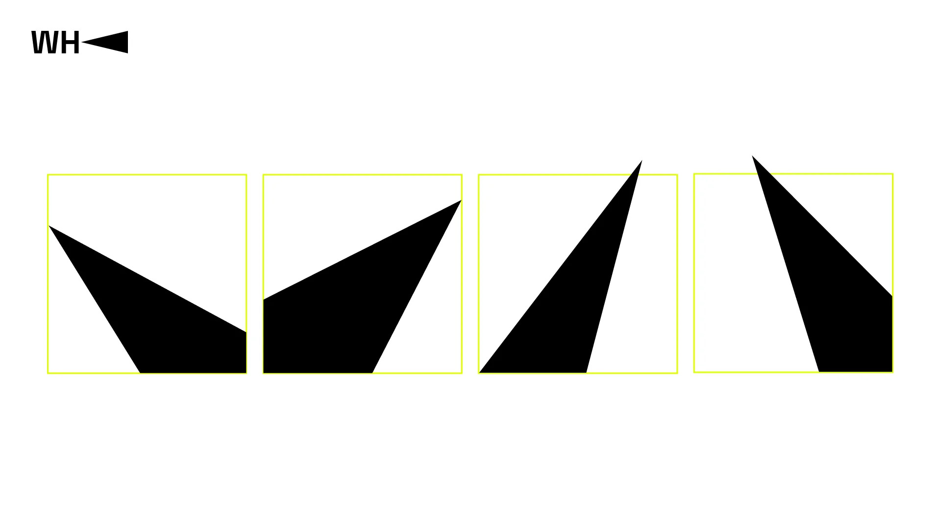
A brand identity includes a logo, color scheme, typography, and other design components. The company's new logo consists of capital letters "WH" and a spotlight beam, which is an element of practically any entertainment show. The beam also carries symbolic meaning as it directs viewers' attention to the necessary details, allowing even the most minor nuances to be noticed.

WePlay Holding logo. Source: WePlay Holding
The new colors also symbolize the show concept: neon lemon represents the light of spotlights, while black serves as the perfect background for any memorable event.
"Rebranding serves as an impulse for the company and a means of communicating with the audience. The market is constantly changing and evolving, just like we are: creating new projects, constantly generating ideas, and building our own infrastructure in the gaming and entertainment industry. WePlay Holding continues to strive to get better every day," says Yuriy Lazebnikov, Managing Partner of WePlay Holding.

Main elements of WePlay Holding design. Source: WePlay Holding
The update to the visual style was necessary for the transformation journey of the holding. WePlay started as a single company organizing esports tournaments, and its identity reflected the gaming aspect. Today, WePlay Holding is a business that includes a content production company WePlay Studios, a fighting game platform DashFight, and an analytics platform Esports Transfers. The holding aims to unite enterprises and projects in the gaming and entertainment industry and support them, as well as new projects that will emerge on their path to success in their respective niches. Therefore, the new brand identity has become part of the image of WePlay Holding, reflecting everything happening within the company.
Source:


