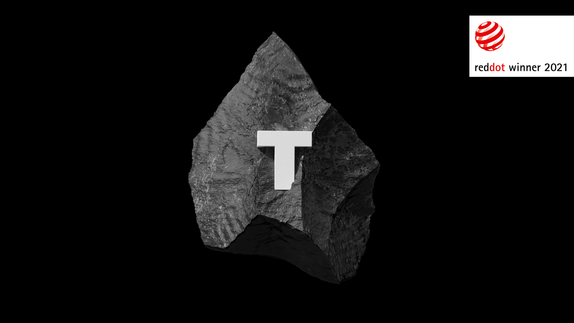
The corporate identity of the TECHIIA holding received the international Red Dot Award 2021 in the Brands&Communication Design category. The identity was developed by the sense it creative agency.
TECHIIA unites more than 10 international companies — from esports to agricultural technologies and the light industry. The identity of the holding was designed to reflect the character and convey the meaning that is embedded in the name — an unrestrained element that defines its own direction.
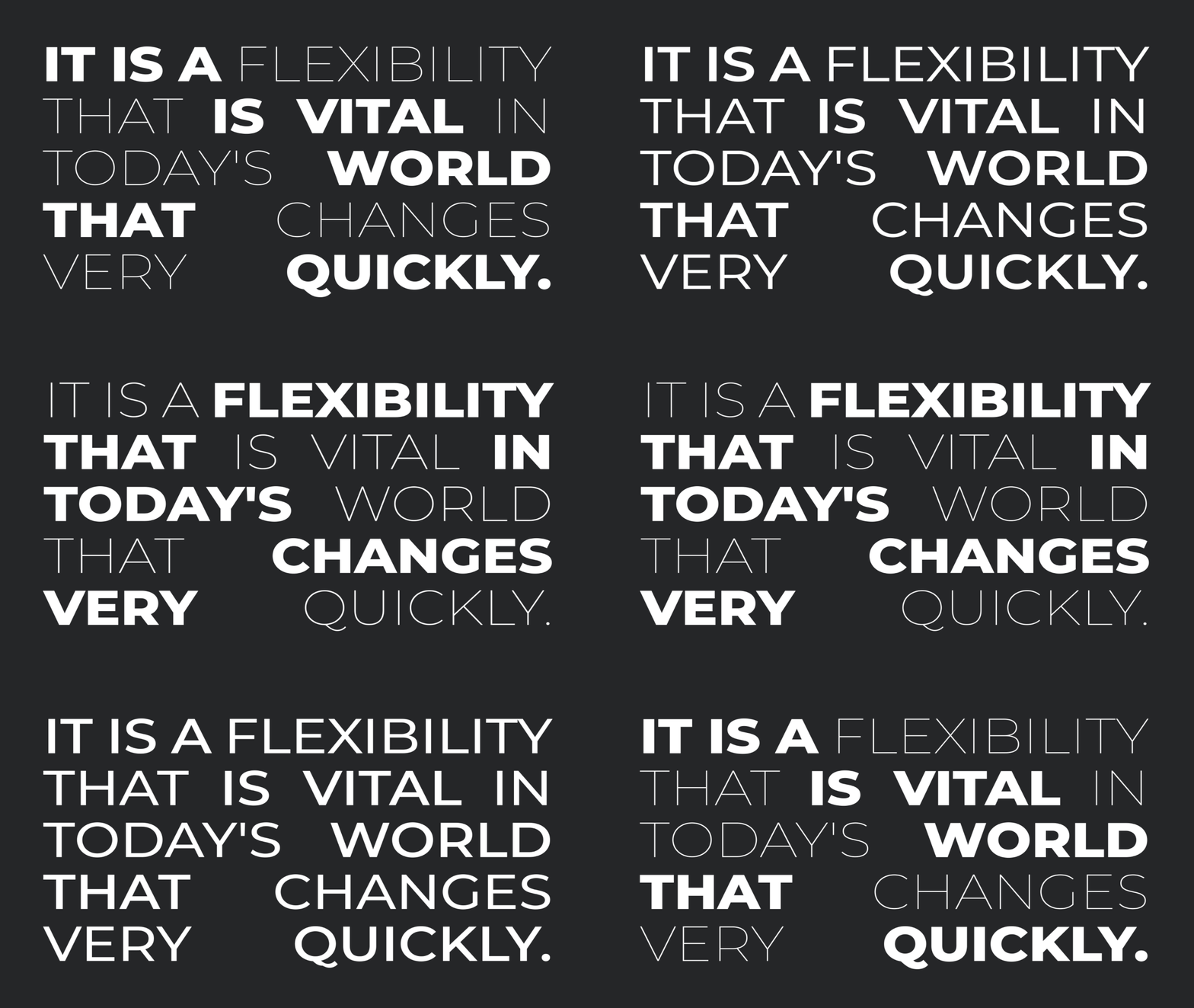
“Through mathematical formulas, we have resembled the flexibility of water waves into style. The Doppler effect was taken as a basis — the phenomenon of the change in frequency of a wave in relation to an observer who is moving relative to the wave source. This is how the philosophy of the holding received a visual metaphor: constant movement and development, formation of trends in the world of technology,” explains Alexander Taranenko, the Creative Director of sense it.
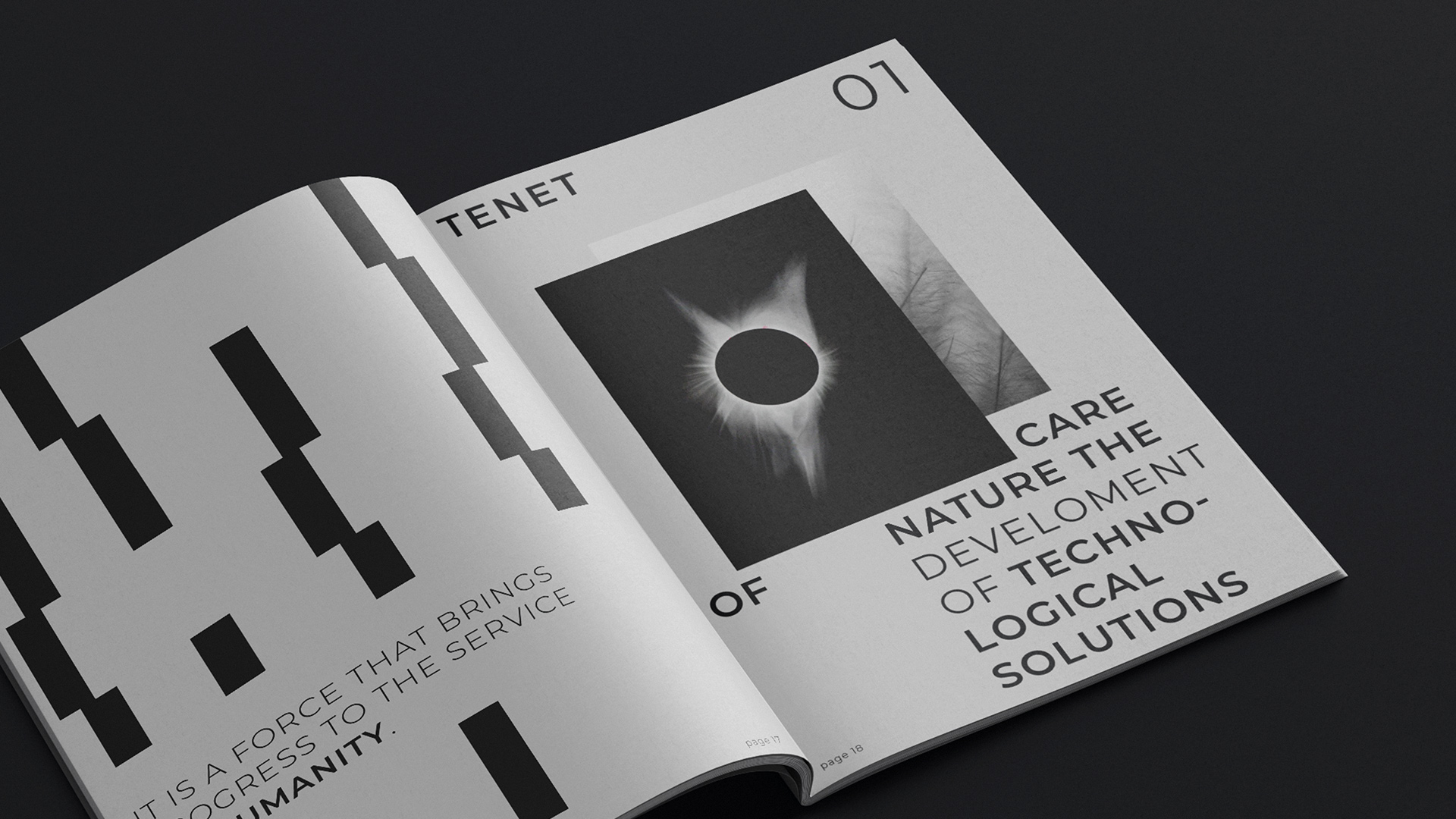
The foundation of the identity is the grid, symbolizing the waves from the source. It can be progressed vertically, horizontally, or in both directions. The grid is convenient to use on promo materials of any size — from business cards to large billboards.
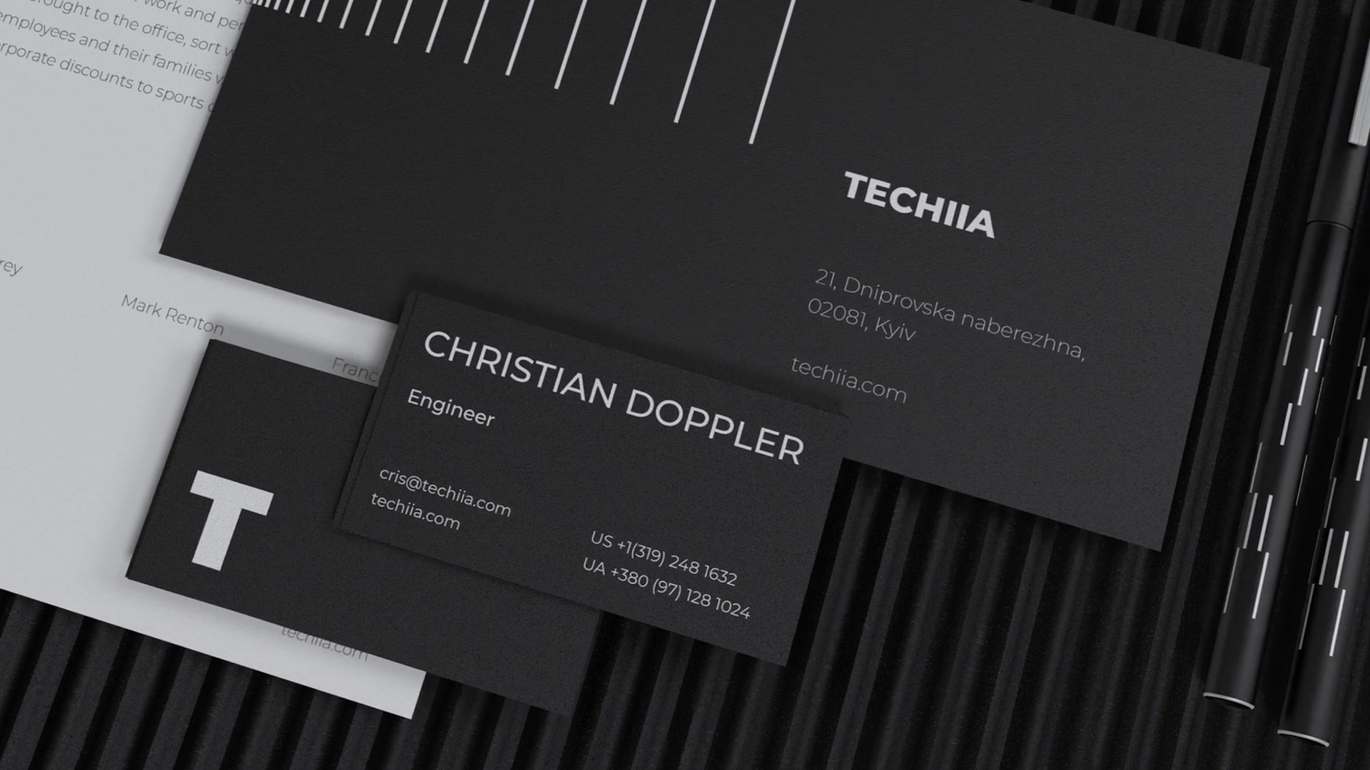
The creative team came up with black and white as the main corporate identity colors. The first absorbs light and symbolizes interest and thirst for knowledge. The second includes the full spectrum of all colors and shows the unification of all aspects of the world. Together they represent the unity of nature and technology.
“We received a design that clearly reveals TECHIIA’s values and ideas. It is modern, laconic, easy to adapt to various media and platforms. Not only is the Red Dot award recognition of the team's talent, but yet another great award of Ukraine on the world’s creative map. It is a real honor,” says Ivan Rogovchenko, the Chief Design Officer of TECHIIA holding.
